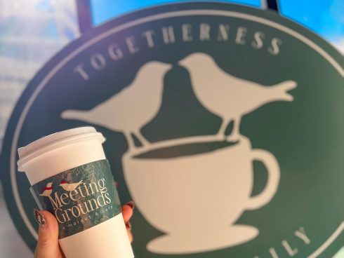
After your brand’s name, your logo is the most important representation of your company that customers notice. Your logo acts as the face of the company, and as such, it sticks with customers each time they encounter your brand. Consumers make decisions based on a myriad of impressions, but your logo is one of the first impressions that your brand will make. A logo conveys personality, company culture, and unique identity, so it’s important that it’s telling the right story. You want the logo to speak to your core values, your expertise, and to sway potential customers to bring their business to your business as opposed to your competitors. A well-designed logo speaks volumes and suggests that you take great pride in the quality of product you manufacture or serve; that you are as thoughtful about the perception of your business, as you are about the customer experience.
As design trends change, and companies grow and adapt, so to should your logo. Does your logo read as well on your website as it does on your menus, coasters, and sleeves? Does it still look as fresh and relevant today, as it did when you developed it? Design aesthetic changes over time and everything from fonts to forms can begin to look tired or cliche. When a logo looks outdated, it can convey a loss of relevance, and your brand may lose some of its appeal.
Here at Sleeve a Message, one of our founding ideas was to help our customers keep the messaging on their sleeves as fresh as the coffee in their cups. When creating our logo it was important that it reflect that core idea. As the company has grown and evolved, it became clear that our logo should do the same in order to better convey our purpose.
 First, we felt that our icon could be streamlined to more clearly communicate our mission; putting messages on sleeves. As a full-color printing company, we wanted to introduce vibrant, friendly colors that work as well in print as they do on screen. We chose a gradient to denote the energy of a company with momentum, reflect current design sensibilities, and create an approachable feel. The font we used combines the modern look of clean, sharp lines, softened by subtle curves. It was also important to select a typeface that reads well across multiple web and print platforms.

If you have been thinking about freshening up your logo, now is the time, and the design team at Sleeve a Message can help! Updating your logo may create a renewed sense of relevance and can help increase brand awareness. Your existing customers will take notice of the new look, and you are likely to capture a new audience.


